在之前介绍了Matplotlib绘制散点图,点击查看。这篇博客以一个更加具体和稍微复杂点的例子对Matplotlib进行介绍。直接上画好的图,如下。
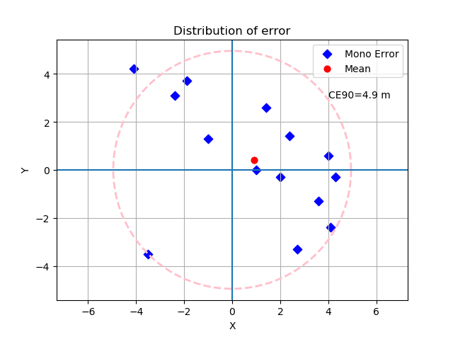
图中主要包含图例、坐标线、圆、虚线、不同类型的点、格网等要素,算是各种要素覆盖的比较全的了。下面直接贴代码。
1.代码
# coding=utf-8
from matplotlib import pyplot as plt
import numpy as np
import math


def readData(file_path):
    text_file = open(file_path)
    data_item = []

    points_x = []
    points_y = []

    line = text_file.readline().strip('\n')
    data_item.append(line)
    while line:
        line = text_file.readline().strip('\n')
        if line != '':
            data_item.append(line)

    for i in range(data_item.__len__()):
        data = data_item[i].split(' ')
        points_x.append(float(data[0]))
        points_y.append(float(data[1]))

    return points_x, points_y


pts_x, pts_y = readData("points.txt")

# 求出平均值点
mean_x = np.mean(pts_x)
mean_y = np.mean(pts_y)

# 求出各点到原点的距离以及获取第90%的那个点所对应的距离
dis = []
for x, y in zip(pts_x, pts_y):
    dis.append(math.sqrt(x * x + y * y))
dis.sort()
index = int(dis.__len__() * 0.9)
r = dis[index]
print r

# 绘制圆,指定半径、圆心
r = dis[index]
a, b = (0., 0.)
theta = np.arange(0, 2 * np.pi, 0.01)
x = a + r * np.cos(theta)
y = b + r * np.sin(theta)
# 以虚线方式绘制圆
plt.plot(x, y, color='pink', linestyle='--', linewidth=2)
plt.axis('equal')
plt.title("Distribution of error")
plt.xlabel("X")
plt.ylabel("Y")
# 添加文本
plt.text(int(r - 0.1 * r), int(r - 0.3 * r), "CE90=" + round(r, 1).__str__() + " m")

# 开启格网
plt.grid(True)
# 绘制加粗坐标轴
plt.axvline(0)
plt.axhline(0)
# 绘制散点
points = plt.scatter(pts_x,
                     pts_y,
                     s=40,
                     c='b', marker='D')
# 绘制均值点
mean_pt = plt.scatter(mean_x,
                      mean_y,
                      s=40,
                      c='r')
# 绘制图例
plt.legend([points, mean_pt], ['Mono Error', 'Mean'])
# 保存绘图
plt.savefig('figure', dpi=600)
plt.show()
以上,便是绘图的相关代码了。
实验数据可以自己随便输入,格式为x空格y,不想改代码的话直接把坐标点文件名写成points.txt即可。
本文作者原创,未经许可不得转载,谢谢配合